From Photoshop to Figma: Building a Scalable, Structured Design System
How transitioning from Photoshop to Figma allowed us to build a scalable, consistent, and collaborative design system from the ground up improving efficiency, clarity, and the overall product experience.
When I was asked to help build a design system from the ground up, the team was still working in Photoshop. And while everything was thoughtfully organized in its own way, the workflow just wasn’t scalable for a growing digital product.
Each new screen or component lived in a separate file. Updates had to be manually repeated. Collaboration was difficult, only one person could work on a file at a time. It wasn’t a lack of effort, but a limitation of the tools.
That’s why moving to Figma was a real turning point. We finally had a collaborative, flexible platform to bring structure and scalability into our design process.
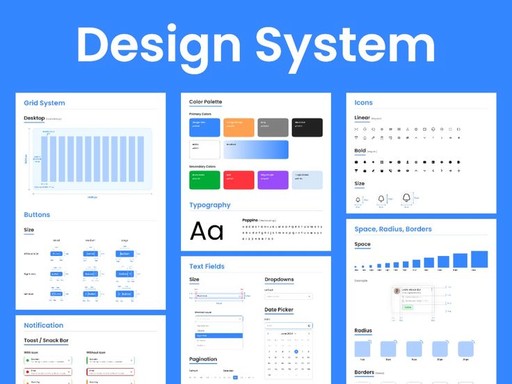
🔧 Step One: Foundations First
The first thing we tackled was the basics: typography and color.
We defined a consistent type system that would work across different platforms (for example, radio and Kombi). Then we reviewed all existing colors, unified those that were too similar, and built a token system with Figma variables using:
Global tokens (base values)
Semantic tokens (used in context)
Component tokens (for UI specifics)
We also defined a spacing scale to bring consistency across paddings and layouts.
🎯 Creating a Unified Icon Library
One of the biggest improvements was centralizing iconography. Previously, each icon existed as a separate Photoshop file. It worked, but it made searching and maintaining consistency a challenge.
We created a new icon library from scratch in Figma: searchable, reusable, and always up to date.
🧱 Componentization & Organization
We moved from scattered components across multiple files to a single, well-structured library in Figma.
This involved:
Organizing components by context and interaction type
Applying consistent structure, naming, and auto layout
Creating responsive variants and clear usage rules
The result: a robust design system that scaled with the product, accelerated iteration, and simplified handoff to development.
⚡ The Impact
The transition to Figma and a unified system brought several key improvements:
Faster iteration — changes propagated automatically
Improved consistency — across screens and components
Better collaboration — multiple people could design simultaneously
Clear documentation — easier handoff to devs and onboarding
We went from a design process that worked okay, to one that truly supported scale, agility, and precision.
✨ Final Thoughts
Design systems aren’t just about components or tools. They’re about building a smarter way to work. For us, moving to Figma allowed that shift to happen. It wasn’t about replacing everything, but evolving it: keeping what worked, improving what didn’t, and creating a foundation that helps the whole team and ultimately, the user.