Casa Forn: Designing the Digital Soul of a Rural Guesthouse
A warm, rustic and conversion-oriented website built from scratch to boost direct bookings.
👩💻 My role


🎯 The Challenge
Casa Forn’s previous web presence was outdated, inconsistent, and did not reflect the soul of the guesthouse. Bookings were mostly handled manually, with little clarity for visitors. The challenge was to create a digital experience that was visually warm, emotionally appealing, and functionally efficient, especially on mobile devices.
🔍 Process
📚 User Research & Benchmark
Conducted interviews with the owners to understand their brand values, typical guests, and pain points.
Analyzed booking behaviors and the competition (similar rural stays and Airbnb-like platforms).
Defined key user needs: easy navigation, trust in the place, and quick booking access.
🔧 Information Architecture & Wireframing
Designed the site map and navigation to emphasize essential content: rooms, location, experience, and booking.
Wireframed page layouts with a focus on readability, call-to-actions, and visual storytelling.
🎨 Visual Design
The design needed to express warmth, simplicity, and authenticity:
Color palette: Earthy tones inspired by stone, wood, and greenery
Typography: Traditional serif for headers + clean sans-serif for body text
Imagery: Large, immersive photos emphasizing texture and atmosphere
Every element was chosen to reflect the personality of the guesthouse and make visitors feel "at home" even before arrival.
🧪 Prototyping & Testing
Using Figma, I designed responsive prototypes and tested with real users:
Participants:
Guest testers (mobile and desktop)
The owners (clarity, usability, voice)
Key Iterations After Testing:
Simplified the contact form to one screen
Moved the "how to get here" section higher in the flow
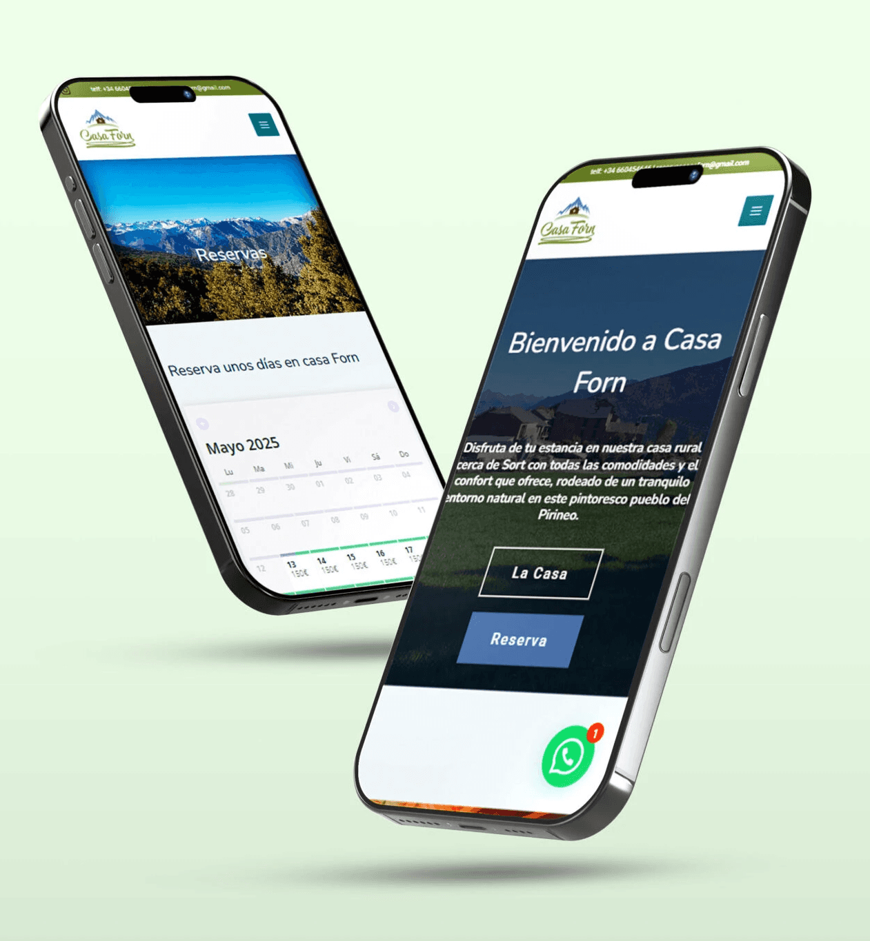
Added WhatsApp button for fast, direct communication
🚀 Outcome
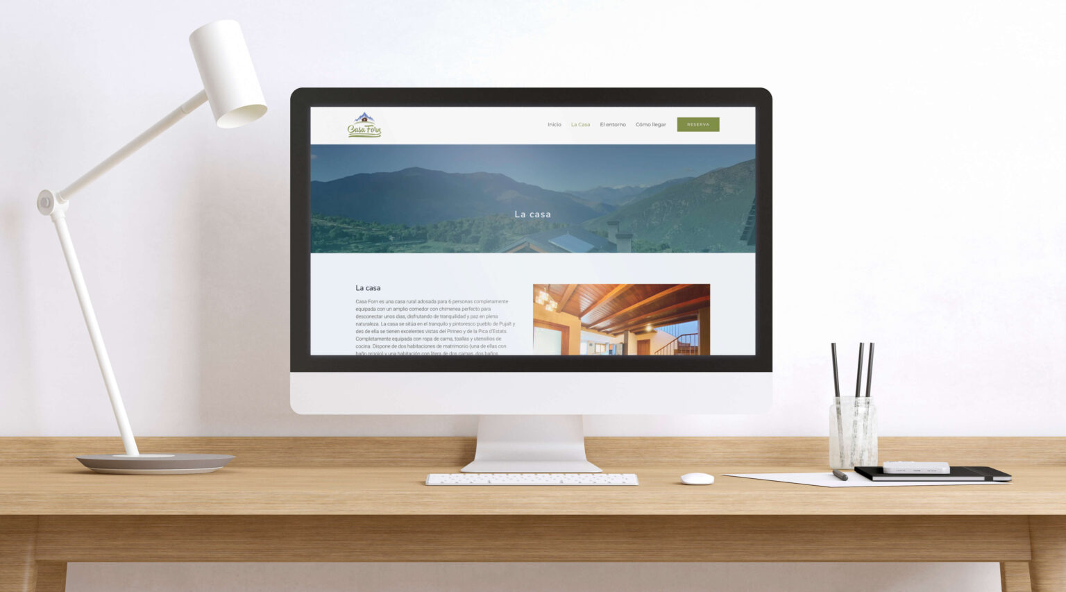
A responsive, aesthetically coherent website that reflects the character of Casa Forn.
Simplified navigation and improved content hierarchy, resulting in better user flow and clarity.
The owners now manage bookings more efficiently and receive compliments from guests about the website’s warmth and ease of use.
📈 Project Impact (12-months post-launch)
350+ unique visitors
20+ direct bookings via form and WhatsApp
60% mobile usage
Avg. session duration: 2 min 17 sec
✨ Final Reflections
This project was a great opportunity to combine brand design with UX strategy in a real-world context. It sharpened my ability to translate emotional values into UI elements and collaborate closely with non-technical clients.
If I were to improve it further, I’d explore adding a simple booking engine and collecting user data to iterate on performance.